Tuesday, May 21, 2024

99 Red Balloons Go By

Reuters reports that since December China has sent more than 100 balloons over Taiwan, often passing through air corridors used by civilian aircraft. It is unknown what the balloons are being used for, they could be weather balloons, but many suspect that they are being used to spy on Taiwan.

You may remember that in February last year many Americans became enraged by the presence of a Chinese balloon spotted over the United States. On that occasion the New York Times was able to use satellite imagery to work out the provenance of the balloon. In Tracking the Chinese Spy Balloon From Space the NYT was able to determine that the balloon had been launched from (or near) Hainan Island in China.

Reuters has now mapped out the flight paths of the balloons which have been spotted over Taiwan since December of last year. An animated scrollytelling map In Tracking China's 'grey zone' balloon flights over Taiwan visualizes the paths of all the possible Chinese spy balloons flying over the Southeast Asian island between December and April of this year.

The 'grey zone' reference in the Reuters headline hints at the news agency's take on the balloons as being used as gray-zone warfare, "designed to exhaust a foe using irregular tactics without resorting to open combat." Another data visualization in the Reuter's article shows that the balloons have been flying at much too low altitudes to be useful as weather balloons, indicating that they probably serve some other purpose.

Monday, May 20, 2024

Spreading Love & Peace in Nutopia

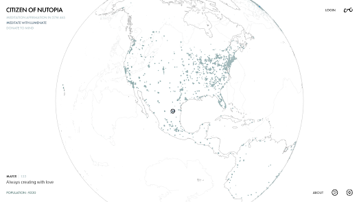
interactive map showing citizens of Nutopia around the world

Nutopia is a conceptual country which was created by John Lennon and Yoko Ono in 1973 as a form of artistic expression and social commentary. Nutopia was created to be a utopian country with no land, no borders, and no passports, symbolizing an idea of peace and global citizenship.

The country of Nutopia has a white flag, symbolizing its surrender to peace, and its national anthem is a few seconds of silence, representing harmony and tranquility. John and Yoko's Nutopia exists as an idea rather than a physical place, emphasizing the transcendence of national boundaries and the unity of all people.

You can now become a Citizen of Nutopia and receive your very own Nutopia ID card. The Citizen of Nutopia interactive map shows the locations of the current 9,000+ citizens around the world. Using the map you can also read the messages posted by each citizen and "Spread love by clicking the ♡ next to a Citizen's name". 

Citizen of Nutopia appears to have a bit of a gaming element attached to it, in that you can also share your ID on social media and with your friends. You can then 'earn points' when someone scans your QR code and follows the link to sign up to be a citizen of Nutopia.

May is Mental Health Awareness Month and Citizen of Utopia also encourages people to donate the mental health charity Mind.

Saturday, May 18, 2024

Man Made Star Signs

an animated map showing a constellation created from space debris

Space Trash Signs has hit upon a novel and fascinating way of visualizing the problems of space pollution. According to NASA there are around 9,000 tonnes of debris now floating around Earth at speeds of up to 25,000 km an hour. Space Trash Signs uses this debris to create new astronomical constellations or 'star signs'.

In 1978 NASA scientist Donald J. Kessler published a paper which argued that if the number of satellites in Low Earth Orbit reached a certain critical level, then even a small collision could create enough debris to cause a chain reaction that would eventually make further space exploration impossible. What has come to be known as the 'Kessler Syndrome' (or 'Kessler Effect') is the estimation that a critical level of space debris will eventually make it impossible to launch new satellites or spacecraft into LEO, as they would be at risk of being damaged or destroyed by this debris.

Space Trash Signs is a fun way to raise awareness of the problems of space debris. This space debris does not reflect enough light to be seen from Earth so the imagined constellations created by Space Trash Signs aren't actually visible in the night sky.

Last year Steve Wozniak's Privateer Space company launched an interactive map to visualize Earth's orbital debris problem. The Wayfinder interactive map shows the location of space junk and Earth satellites in near real-time. If you click on a cluster of space debris in one of the constellations created by Space Trash Signs you can click through to view its near real-time location in Earth's orbit on the Wayfinder interactive map.

Via: Webcurios

Friday, May 17, 2024

Segregation in the U.S.

US map with counties colored to show the levels of school segregation
Stanford University's Segregation Explorer visualizes the levels of segregation between schools and school districts in the United States. Developed by the Educational Opportunity Project at Stanford University, this new interactive map shows the levels of segregation across various regions, including states, metropolitan areas, school districts, and neighborhoods.

The new map includes school segregation data for the last thirty years. This temporal data shows that white-black segregation in schools in the United States has actually increased by 35 percent since 1991. Some of the most segregated counties highlighted by the Segregation Explorer are found in large urban districts. For instance, three large urban school districts – LAUSD, Philadelphia and New York City - show high levels of racial and economic segregation within their schools. These areas exhibit significant disparities in racial and economic compositions between schools, reflecting broader national trends of increased segregation over the past few decades.

The Segregation Explorer primarily focuses on racial and ethnic segregation, providing insights into how different racial and ethnic groups are distributed across various geographic areas. The map allows users to explore school segregation at state, county and school district levels, and view segregation trends over time since 1991.
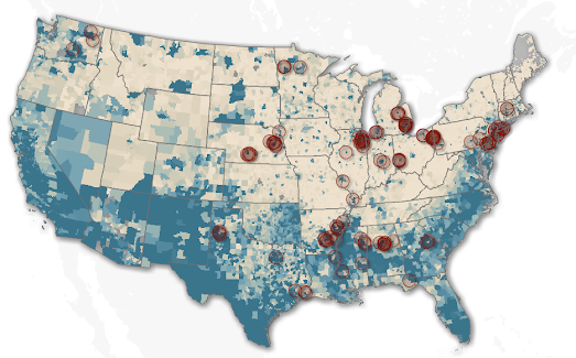
US map showing the 100 most segregated neighboring school districts

Earlier this year the think tank New America also released an interactive map which visualizes school district segregation by race and poverty levels. The Crossing the Line map identifies the 100 most racially segregated neighboring school districts and the 100 most segregated neighboring school districts by school-age poverty rates. It highlights those areas in the USA which have the starkest segregated school districts by race and by poverty level.

According to the New America data Birmingham, Alabama has some of the most segregated school district borders in the country. Birmingham City School District and Mountain Brook City School District are the two neighboring districts which have the starkest racial segregation in the USA, based on the 'percentage of students of color enrolled'. These two school districts are also the fifth most segregated by the school age poverty rates in each district.

New America argues that because of America's long history of racist housing segregation there is now a marked trend of lower property values in 'communities of color'. Because school funding is usually dependent on the levels of local property taxes school districts in areas with lower property values can spend less per student than those in more affluent areas. According to New America on average the "districts serving more students of color collect $2,222.70 less in local revenue per pupil than the predominately white districts". 

Thursday, May 16, 2024

Warmer Stripes for 2023

visualization showing average global temperaures for every year since 1850 as colored stripes
average global temperatures since 1850

Ed Hawkins' Warming Stripes visualization has now been updated to include 2023. Last year was the warmest year since accurate global records began. Globally the average temperature was 1.18°C (2.12°F) above the 20th-century average of 13.9°C (57.0°F). This means that your local warming stripes will probably now end with a very dark maroon colored stripe representing last year's intense heat.

#ShowYourStripes uses historical climate data to visualize average temperatures around the world for the last 173 years. Each stripe represents the average temperature for a single year, with reds signifying warmer than average years and blues cooler than average years. On the visualization stripes are ordered chronologically so that the stripes depict a clear warming trend over time. The most recent stripes, representing the last few decades, are predominantly red, highlighting the accelerated pace of global heating.

#ShowYourStripes also now includes an interactive map. The map allows you to zoom in on areas of the world to view the warming stripes for individual cities. Click on a marked city and you can view its warming stripes in an information window, click-through to view the city's warming stripes in more detail, and download the stripes as an image.

Wednesday, May 15, 2024

Is Europe Ready to Burn?

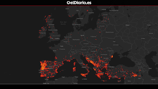
map of Europe showing all megafires since 2000

This week Spanish news site El Diario wondered if Europe was ready for megafires. One of the most noticeable consequences of global heating over the last few years has been the increase in large wild fires across the world. 

In Megafires Burn Europe El Diario has mapped out all the wildfires in Europe this century which have burnt an area of more than 500 hectares. Two accompanying graphs show both the increasing frequency of these large fires in Europe and their increasing size over the last decade.

The El Diario map of this century's magafires shows that southern Europe is most affected by wildfires. Portugal, Spain and Greece respectively have experienced the most area burnt by megafires. In its article El Diario uses a storymap format to highlight some of the areas which have seen the largest concentration of these fires.

El Diario is unequivocal in blaming climate change for the increasing severity of wildfires in Europe and note that the 'situation is going to get worse'. They say that according to climate change projections by the end of this century Spain, Italy and Greece will experience between 20% and 40% more days when climate conditions are favorable for the expansion of forest fires.

Via: Data Vis Dispatch

Tuesday, May 14, 2024

Welcome To Your New Gardening Zone

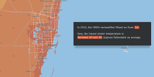
map of Miami showing its new plant hardiness zone (11a)

In November of last year the US Department of Agriculture (USDA) updated the US plant hardiness map based on the latest weather data (1991–2020). The USDA Plant Hardiness Zone Map is a tool which is designed to help gardeners determine which plants are most likely to thrive in their location. 

The USDA map is divided into 13 zones based on average coldest temperatures. Zone 1 is the coldest zone, with average annual minimum temperatures below -55°F, while Zone 13 is the warmest zone, with average annual minimum temperatures above 65°F.

NPR has released a new interactive map which allows gardeners to discover their new plant hardiness zone and what this means for their gardens. Enter your location into the article, The USDA’s gardening zones shifted. This map shows you what’s changed in vivid detail, and NPR will show you your new plant hardiness zone, and the lowest average temperatures in your zone. The map will show you how much warmer this is than your previous average lowest temperatures.

As well as allowing you to discover your new Plant Hardiness Zone the NPR article does a very good job at explaining what the zones do and don't tell you about the kinds of plants that you can and can't grow in your garden. It explains how different locations within the same zone can still have widely different climate conditions which can affect which plants will thrive in your particular garden and climate.

Monday, May 13, 2024

Can You Draw America?

a satelitte map of the US on which an idiot has tried to draw the outlines of a few states

This morning I discovered that my geographical knowledge of the United States is ten times worse than I previously thought. Judging by my attempts to draw the outlines of all 50 states onto a blank map of the U.S. my application to the American Geographical Society is probably going to be summarily rejected.

Regular readers of Maps Mania (yes both of you) may remember that in March I posted a link to Huge Quiz's Europe Country Drawing Challenge. In this game players are challenged to draw the borders of European countries on top of a satellite map of Europe. For each country drawn points are awarded based on how much of the drawn area contains the actual named country and how much of the actual country is contained in the drawn area.

In March I discovered that I have a very bad knowledge of basic European geography. Today I learned that my knowledge of American geography is even worse. So far I have attempted to draw ten states in the U.S. State Drawing Challenge. I managed to score 0 points for Maine, Nevada, Montana, and Nebraska. The only two states I have managed to draw with any reasonable accuracy so far are California and Washington.

Due to the costs of using the Google Maps API Huge Quiz periodically restricts access to its games to premium members. This week the Europe Country Drawing Challenge is restricted. However (at the time of writing) the U.S. State Drawing Challenge is available to anyone.

Saturday, May 11, 2024

Active Video

screenshot of Eyes in the Prize showing the video, map and timeline

Glen Chiacchier has devised an interactive mapped, timeline for the American civil rights documentary Eyes on the Prize. His 'active video' of Eyes on the Prize turns what might otherwise be a passive viewing exercise into an active learning experience by providing viewers with the opportunity to browse the documentary by date and location. 

The civil rights documentary Eyes on the Prize was a 14 part history of the 20th-century civil rights movement in the United States which originally aired in the late 1980s. Glen's 'active video' allows you to watch and explore Episode 2 - "Fighting Back (1957–1962)".

Instead of passively watching the video Glen's active video allows you to browse the video by location (using place-name links on an interactive map) or by date (using links on a chronological timeline). A transcript of the video is also provided, with space for viewers to add their own annotated notes on sections of the documentary. 

Glen notes that the "video can still be enjoyed passively if desired, but now viewers have a low-friction way of engaging further." The format is particularly useful for research. Most 'academic' reference books contain contents and index pages, which help students and researchers to quickly access the information that they need. This kind of 'active video' template really could help students and researchers browse and reference video documentaries. 

Friday, May 10, 2024

The Secret Life of Bridges

an animated map showing the cumulative growth of bridges in the U.S. since 1800
This amazing animated map visualization shows the cumulative growth of bridges in the U.S. since 1800. The map reveals the development of mass transport over the last two centuries and the enormous role that bridges play in the U.S. economy.

The animation is just one of a number of impressive mapped visualizations in Esri's Secret Life of Bridges. The Secret Life of Bridges is an Esri story-map which looks at the history of bridge construction and also explores the current condition of the country's contemporary bridges. There are over 618,000 bridges in the United States. Esri says that "roughly one out of every 13 bridges - about 46,000 in total - are considered to be in poor condition". 

Using interactive mapped visualizations of the grades awarded to bridges every four years by the American Society of Civil Engineers Esri has identified the areas of the country with the highest proportion of bridges in a poor condition. This helps to pinpoint the regions of the United States which are most in need of investment. The Secret Life of Bridges includes an interactive map which colors each county based on the percentage of its bridges in a poor condition. Click on a county on this map and you can view the country's total number of bridges, the average age of the bridges and the percentage deemed to be in a poor condition.