Money “Front & Center”

This is a note to my long time readers that I have earlier this year moved my blogging to Substack.

At Substack, posts are called newsletters, and so no one has any doubt about the focus of my newsletter, I´ve named it “Money Fetish”.

Below a link to my latest “post”. Hope you like it and subscribe (free) to receive my newsletters in your e-mail box. Feel free to browse past issues.

Thanks to all

Marcus

https://marcusnunes.substack.com/p/the-economy-in-the-first-quarter

Does the “Monetary Theory of Nominal Income” stand scrutiny?

Fifty years ago, Milton Friedman published in the JPE “A Monetary Theory of Nominal Income”. I highlight two passages from the paper.

Correspondence of the Monetary Theory of Nominal Income with Experience

I have not before this written down explicitly the particular simplification I have labelled the monetary theory of nominal income—though Meltzer has referred to the theory underlying our Monetary History as a “theory of nominal income” (Meltzer 1965, p. 414). But once written down, it rings the bell, and seems to me to correspond to the broadest framework implicit in much of the work that I and others have done in analyzing monetary experience. It seems also to be consistent with many of our findings.

One finding that we have observed is that the relation between changes in the nominal quantity of money and changes in nominal income is, almost always, closer and more dependable than the relation between changes in real income and the real quantity of money or between changes in the quantity of money per unit of output and changes in prices.

This result has always seemed to me puzzling, since a stable demand function for money with an income elasticity different from unity led us to expect the opposite. Yet the actual finding would be generated by the monetary approach outlined in this paper, with the division between prices and quantities determined by variables not explicitly contained in it.

…On still another level, the approach is consistent with much of the work that Fisher did on interest rates…In particular the approach provides an interpretation of the empirical generalization that high interest rates mean that money has been easy, in the sense of increasing rapidly, and low interest rates that money has been tight, in the sense of increasing slowly, rather than the reverse.

A few pages later in Short-Run Adjustment of Nominal Income, Friedman writes:

For monetary theory, the key question is the process of adjustment to the discrepancy between the nominal quantity of money demanded and the nominal quantity of money supplied…The key insight of the quantity-theory approach is that a discrepancy will be manifested primarily in attempted spending, thence in the rate of change in nominal income.

Put differently, money holders cannot determine the nominal quantity of money, but they can make velocity anything they wish.

What, on this view, will cause the rate of change in nominal income to depart from its permanent value? Anything that produces a discrepancy between the nominal quantity of money demanded and the quantity supplied, or between the two rates of change of money demanded and money supplied.

In symbols, the equation of exchange (in growth form) says that M+V=P+y, with M being money supply growth, V velocity growth, P inflation and y real output growth.

By “ignoring” the division between prices (P) and quantities (y), we are only concerned with aggregate nominal spending growth (or NGDP). In this way, an “appropriate monetary policy” is one that maintains nominal stability (or a stable growth of nominal spending). In other words, an “appropriate monetary policy” is one in which money supply growth offsets changes in velocity to keep NGDP growth stable.

As I´ll show later, it is not just the stable growth rate of NGDP that matters, but also the Level Path of spending along which that growth takes place. That´s the reason Market Monetarists favor NGDP-Level Targeting as the central bank´s framework.  

Before going ahead, I think it is useful to put the Monetary Theory of Nominal Income in context.

Traditional versions of monetarism, still followed today, assume velocity is stable. With that assumption, the equation of exchange in growth form is written (to an approximation) as M=P+y or M-P=y so that statements such as:

“In a large body of work with a number of colleagues Friedman demonstrated that inflation was “always and everywhere a monetary phenomenon”, meaning that it arose over extended periods only when the quantity of money increased more rapidly than the quantity of goods and services.

Are not valid.

When Friedman concluded that money holders cannot determine the nominal quantity of money, but they can make velocity anything they wish, he was led to the view that the relation between changes in the nominal quantity of money and changes in nominal income is, almost always, closer and more dependable than the relation between changes in real income and the real quantity of money or between changes in the quantity of money per unit of output and changes in prices.

The other contender, New Keynesianism, is a way of analyzing the economy with a mere three equations, none of which refers to the quantity of money. A “two line summary” would be:

In New Keynesian analysis, monetary policy (interest rate policy) determines real GDP, which in turn determines inflation via a Phillips curve.

[Notes: In what follows, for the money supply, I consider the Divisia M4 index, a very broad measure of the money supply. The data are available at the Center for Financial Stability and a good discussion of the indices construction and usefulness for monetary policy is “Getting it Wrong”, by William Barnett. For inflation, I consider the headline PCE in order to take account of supply shocks such as oil prices. For unemployment, I use the Core version, which does not consider “temporary layoffs”. That´s a fixture of the “Covid19 pandemic”, with the two measures, core & headline unemployment, showing little difference for all other periods. For details, see here.]

To check if the Monetary Theory of Nominal Income stands up to scrutiny, I analyze several periods over the last 30 years. For each period, the top chart shows the “outcome” of M+V=P+y(NGDP), while the bottom chart shows what happened to “pieces” of the economy; RGDP(y), Inflation(P) and unemployment.

The first chart covers the 1990s.

Monetary policy was quite good. In the top chart, we observe nominal income (NGDP) growth was stable, with some sign of instability occurring when money supply growth did not adequately offset velocity changes.

In the bottom chart, RGDP growth “mimicked” nominal income growth. The unemployment rate fell almost continuously and inflation remained low (close to “target”). Towards the end of the period, inflation falls. That´s due to the occurrence of two positive supply shocks; the fall in oil prices following the Asia crisis 0f 1997/98 and the rise in productivity growth from 1997.

It appears that a monetary policy geared to keeping NGDP growth on a stable path gives out “good results”.

The second chart illustrates the more “confusing” follow-up period.

When the Asia crisis and Russia crisis (remember LTCM?) were “solved”, oil prices began to rise. In 1999 and for most of 2000, monetary policy kept NGDP growth stable. For that interval, RGDP growth remained stable and robust and unemployment still fell somewhat.

The combination of low unemployment and rising inflation signaled red flags to the Fed. Velocity fell significantly while money supply growth was “timid” in offsetting it. NGDP growth fell strongly, from about 5.5% to close to 2%. The effect on RGDP growth of the negative supply shock was magnified and unemployment rose.

 With monetary policy succeeding in stabilizing NGDP growth (around 4%), unemployment remains higher but stable. Around mid-2003, the Fed becomes more expansionary adopting “forward guidance”. Velocity rises (and money supply growth does not offset it). NGDP growth climbs to the 5% range, RGDP growth picks up and unemployment begins to fall. The end of the oil surge and the recession of 2001 had brought inflation down, and it remained low & stable after that.

The next chart covers the last years of the Great Moderation”, the last two years of Greenspan´s and the first months of Bernanke at the Fed´s helm

Contrary to many that view this period as an example of “bad” (expansionary) monetary policy, I believe monetary policy was close to “perfect”, especially given the fact that it coincides with the first leg of a persistent negative oil shock that extended to mid-2008.

The Dynamic AS/AD model tells us that, because of a negative supply shock, real growth falls and inflation rises. That´s exactly what happens as observed in the lower chart. In the top chart, however, monetary policy remains geared to providing nominal stability (stable NGDP growth).

With that, unemployment remains on a downtrend. I bet Claudia Sahm felt excited by that outcome shortly before she joined the Fed in 2007.

Unfortunately, in early 2006, Bernanke took over from Greenspan, and Bernanke has a “visceral” fear of inflation. The next chart shows that soon after, NGDP growth drops a notch and unemployment stops falling.

With inflation rising and unemployment low, in early 2008 the Fed tightens monetary policy (reflected in monetary expansion falling short of the fall in velocity). Unemployment begins to increase and the fall in RGDP growth is magnified.

At the closing of this period, it´s almost as if the Fed realizes its mistake and loosens monetary policy somewhat. The unemployment rate, however, does not have time to react because the Fed, scarred of inflation due to oil price increases tightens massively, as seen in the chart below.

The evidence for that comes from Bernanke himself:

Bernanke June 2008 FOMC Meeting (page 97):

“I’m also becoming concerned about the inflation side, and I think our rhetoric, our statement, and our body language at this point need to reflect that concern. We need to begin to prepare ourselves to respond through policy to the inflation risk; but we need to pick our moment, and we cannot be halfhearted.”

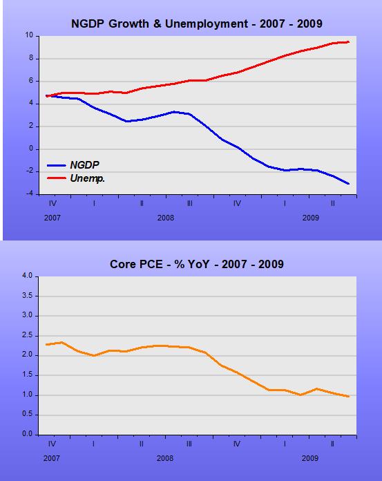
The Great Recession of 2008/09 is on. NGDP growth and RGDP growth sink while inflation goes from 4% to -1% and unemployment shoots up from 6% to 10%.

The next chart, in my mind, is the most compelling evidence for the monetary theory of nominal income approach.

By early 2010, NGDP growth was back to 4% YoY, with NGDP growth averaging 4% over the next 10 years. That was not due to interest rates remaining at the ZLB until December 2015, but to the fact that money supply growth adequately offset velocity changes to maintain stable NGDP growth.

The bottom chart shows that with nominal stability consolidated, the unemployment rate enters a long period of decline going from 10% to less than 4% before the pandemic began. RGDP growth was very stable around the average of 2.2% and headline inflation remained low and stable, averaging 1.6%.

But, and there´s always a “but”, those 10 years comprise a vivid example of the importance of the level path along which nominal stability occurs.

The chart below illustrates, showing that after the Great Recession, the economy evolved very stably along a much lower nominal income level.

Over the years, the rate of unemployment has become not just a gauge of the health of the labor market but the most common yardstick policymakers use to assess the health of the economy as a whole.

Some have argued that the historically low rate of unemployment attained is testament to the strength of the economy. Unfortunately, that´s not so. When you look at the determinants of the unemployment rate, the employment population ratio and labor force participation, you see that the post Great Recession economy is much “weaker” than the pre GR economy.

Labor force participation provides a measure of the “excitement” conveyed by the labor market. The “low” level of nominal income has “muted” that “excitement”.

Almost one year ago, the pandemic hit. The next chart shows the steep & deep fall in velocity (remember, money holders can make velocity whatever they wish). This time, monetary policy reacted quickly to stop the bleeding.

As the next chart shows, however, monetary policy still falls short of what´s needed, so that the level of NGDP remains below, and even distancing itself from the already low level that prevailed after the Great Recession.

As the pandemic withers with mass vaccination, the demand for money will fall (velocity will rise). The Fed will have to offset this rise in velocity in order to stabilize the growth of nominal income (NGDP). It will also have to choose a level path, hopefully higher than the one it travelled for the 10 years to early 2020!

As the NGDP growth rises to reach a higher-level path, some of that rise could reflect (temporarily) higher inflation. Despite the Fed having adopted Average Inflation Targeting (AIT), a higher inflation will most likely cause “nervousness” at the Fed. That´s probably why, more than 10 years ago, Scott Sumner wrote:

I don’t propose to abolish the phenomenon of inflation, but rather the concept of inflation.  And to be more precise, price inflation, which is what almost everyone means by the term.  I want it stripped from our macroeconomic theories, removed from our textbooks, banished into the dustbin of discarded mental constructs.

Bits & Pieces

The “bits” are the components of the equation of Exchange in growth form:

M+V=P+Y, where

M is the growth rate of money supply, V the growth of velocity (the inverse of money demand), and P+Y the growth of aggregate nominal spending, or NGDP growth.

For the past few months, many look at the high (unprecedented) growth of M illustrated in the chart and say an increase in inflation is just around the corner.

However, when you look at the V “bit”, you see that velocity growth crashed

In fact, money supply growth has fallen short of money demand growth. That becomes clear when you put those two pieces together and add the NGDP growth “piece”.

Notice that before the Covid19 shock, money supply growth adequately offset velocity changes to keep NGDP growing at a stable rate close to 4%.

When the pandemic hit, velocity tanked while money supply growth lagged behind. More recently, money supply growth has been sufficient, given velocity, to keep NGDP moving at sub-zero temperatures.

Hard to imagine that “heat” (inflation) can be generated by a “thermostat” dialed-down to such low temperatures!

Now for the “pieces”. Those refer to the labor market, more specifically to the construction of the unemployment rate. Two “pieces” stand out. The chart shows that data for workers on temporary layoff and for those marginally attached were distorted by the pandemic.

Last June, Jed Kolko devised a “core rate of unemployment” that considers those two anomalies. From the unemployment level he subtracts workers on temporary layoff and adds marginally attached workers (those not in the labor force but prepared to work). The adding permits to count as unemployed those workers that were not able to get their job back after being laid-off.

The chart shows that until the pandemic hit, headline and core unemployment were closely attached, so the core rate now gives us a less misleading view of the unemployment rate.

A zoom of the picture indicates that the discrepancy between the headline and core rates are closing, so shortly we may go back to looking just at the conventional (headline) data.

We can play around with the “bits & pieces”. The next chart shows that the drop in aggregate spending (NGDP) growth in 2020 was much steeper & deeper than what happened in 2008/09. Nevertheless, core unemployment rose much less now than in 2008/09.

Note that in both instances, unemployment stops rising when NGDP growth reverses direction. The question remains, however, about why the huge difference in the behavior of unemployment.

One reason might be the suddenness of the drop in spending. While it took only 4 months for spending to fall from peak to trough, in 2008/09 it took 21 months. Real variables like employment take time to adjust. That still doesn´t explain why unemployment didn´t keep rising even after spending reversed direction.

What guides unemployment is not just the behavior of nominal spending but, more importantly, the ratio of wages to nominal spending (NGDP). The next chart indicates that the rise in the ratio of wages (average hourly earnings) to NGDP jumped from trough to peak in just 2 months and then dropped rapidly, even while NGDP growth was still falling. The 2008/09 story is very different.

The explanation for the (surprising) observation of a relatively small rise in unemployment in spite of a large fall in spending is evident in the next chart, which shows that wages fell in absolute terms, leading to the quick reversal in the wage/NGDP ratio and thus containing the rise in unemployment. In 2008/09, wages rose continuously.

To wrap up, the next picture shows the “end result” of the “bits” (the outcome of monetary policy trying to adequately offset changes in velocity, but failing at present) which helps define the “shape of the pieces” (core unemployment & payroll employment in this case).

Where we observe that faltering monetary policy leads to unemployment not falling and employment being constrained.

Is the new Monetary Policy Framework (AIT) an improvement?

Unlikely. Also, it´s likely not worse and suffers from the same shortcoming of inflation targeting, being based on the false premise of the existence of a Phillips Curve. I plan to show, hopefully convincingly, that the New Keynesian model (the centerpiece of which is the New Keynesian Phillips Curve) is grossly unsuitable for monetary policy analysis.

The FOMC has “chosen” to pursue an AIT framework. Why? Because it is a suggestion that flows directly from a New Keynesian model where the interest rate is constrained by the zero-lower- bound (ZLB).

The oldest reference to AIT I found was a Working Paper from 2000, published in 2005. The Phillips Curve is the driving force of the model (despite the economy being far from the ZLB at the time. Probably the reason was the uncertainty regarding the value of the NAIRU).

JMCB October 2005 (WP version 2000):

The analysis of this paper demonstrates that when the Phillips curve has forward-looking components, a goal for average inflation-i.e., targeting a j-period average of one-period inflation rates-will cause inflation expectations to change in a way that improves the short-run trade-off faced by the monetary policymaker.

The other papers proposing AIT are all from 2019-20, when the Fed was revising its framework.

Two examples

Thomas M. Mertens and John C. Williams June 28, 2019

We use a simple New Keynesian model as a laboratory for our analysis. The economy is governed by a Phillips curve that links inflation to a supply shock, the output gap, and expected future inflation and an IS-curve that links the output gap to a demand shock, the ex ante real interest rate, and expectations of the future output gap.

In “What´s up with the Phillips Curve”, we learn that:

It used to be, when the economy got hot and pushed unemployment down, inflation rose as businesses charged higher prices to meet higher wages and other increased costs.

Changes in the conduct of monetary policy appear to have played some role in inflation stability in recent decades, but they cannot be its principal explanation, the authors suggest. 

Their leading candidate for the driver of inflation stability is a reduced sensitivity of inflation to cost pressures—such as those associated with wage movements—or, in economic parlance, a decline in the slope of the Phillips curve

A flat Phillips Curve requires the monetary authority to work harder to stabilize inflation:  Unemployment needs to get lower to bring inflation back to target after a recession,” the authors write.  They use an econometric model to explore how monetary policy should adapt, examining, for example, a strategy known as average inflation targeting

Joseph Gagnon of the PIIE recently described it thus:

Economies around the world have languished in the flat region of a kinked Phillips curve. Any level of unemployment above the natural rate keeps inflation constant. CBs need to aggressively push unemployment down into the steep region.


The ECB is also revising its framework, but in Europe, the Phillips Curve concept is not as explicit as in the US, though it clearly lurks behind the models.

ECB Working Paper April 2020:

Following a large recessionary shock that drives the policy rate to the lower bound, a central bank with an AIT objective keeps the policy rate low for longer than a central bank with a standard inflation targeting objective, thereby engineering a temporary overshooting in future inflation that helps to mitigate the decline of output and inflation at the lower bound via the expectations channel.

In a recent speech, Charles Evans, president of the Chicago Fed said:

Describing the stance of policy against a moving and unobservable benchmark is another complicated communications challenge.

He was referring to the “neutral interest rate”, but the same communication problems arise regarding the two other famous “moving and unobservable benchmarks”, to wit, the natural rate of unemployment (or NAIRU) and potential output.

Such comments are not new, although they were more of a “what to decide” problem rather than a “communication challenge”.

In the FOMC meeting of December 1995, Greenspan noted wryly:

“Saying that the NAIRU has fallen, which is what we tend to do, is not very helpful. That’s because whenever we miss the inflation forecast, we say the NAIRU fell” (p. 39).

Seven months later, in the July 1996 meeting Thomas Melzer, president of the St Louis Fed commented:

“Whenever we get to whatever the NAIRU is, people decide it is not really there and it gets revised lower.  We get to what people thought would be the NAIRU, we do not see wage pressures, and we assume that the NAIRU must be lower. So it keeps getting revised down.” (p. 61)

There were also the strong believers in the Phillips Curve. This comment from Laurence Meyer in the February 1999 FOMC meeting is an example:

When I think about the inflation process and the inflation dynamic, I always point to two things: excess demand and special factors. I don’t know any other way to think about the proximate sources of inflation. When I think about excess demand, I think about NAIRU. If we eliminate NAIRU and that concept of excess demand, it moves us into very dangerous territory with monetary policy.

I would remind you that in the 20 years prior to this recent episode, the Phillips curve based on NAIRU was probably the single most reliable component of any largescale forecasting model. It was very useful in understanding the inflation episode over that entire period. Certainly, there is greater uncertainty today about where NAIRU is, but I would be very cautious about prematurely burying the concept. (pg 118)

In the same meeting, Edward Boehne, president of the Philadelphia Fed said:

As far as NAIRU is concerned, my personal view is that it is a useful analytical tool for economic research but that it has about zero value in terms of making policy because it bounces around so much that it is very elusive. I would not want our policy decisions to get tied all that closely to it, especially when most of the NAIRU models have been so far off in recent years. (pg 116)

A few months later, in the June 99 FOMC meeting, William Poole, president of the St Louis Fed observed:

I certainly count myself among those who believe that the Phillips curve is an unreliable policy guide. What that means is that the predictive content for the inflation rate – and I’ll emphasize the “predictive” – of the estimated employment gap or GDP gap, however you want to put it, seems to be very low. (pg 106)

One year later, in the June 2000 meeting Poole “nailed down” the problem:

The traditional NAIRU formulation views the wage/price process as running off a gap–a gap measured somehow as the GDP gap or the labor market gap. And the direction of causation goes pretty much from something that happens to change the gap that feeds through to alter the course of wage and price changes.

I think there is an alternative model that views this process from an angle that is 180 degrees around. It says that in an earlier conception, either through a determination of a monetary aggregate or through a federal funds rate policy, monetary policy pins down the price level or the rate of inflation and, therefore, expectations of the rate of inflation. Then the labor market settles, as it must, at some equilibrium rate of unemployment. Where the labor market settles is what Milton Friedman called the natural rate of unemployment. But the causation goes fundamentally from monetary policy to price determination and then back to the labor market rather than from the labor market forward into the price determination. I certainly view the causation in that second sense.

I think it is the willingness of the Federal Reserve to stamp out signs of rising inflation that ultimately pins down expectations of the price level and the inflation rate. Now, the labor market has been clearing at a level that all of us have found surprising. But I don’t think that necessarily has any particular implication for the rate of inflation, provided we make sure that we are willing to act when necessary. (pg 61).

Interestingly, six months earlier, Richard Clarida (who is now Vice Chair of the Fed Board and led the framework Review Process), Gali and Gertler published “The Science of Monetary Policy” in the Journal of Economic Literature. On page 1665 we read:

It is then possible to represent the baseline model in terms of two equations: an “IS” curve that relates the output gap inversely to the real interest rate; and a Phillips curve that relates inflation positively to the output gap.

Which is the opposite of Poole´s “direction of causation”. Unfortunately, this is the view that survived and prevailed, for 20 years later, as seen at the beginning of this post that is the model Mertens & Williams use to, inter alia, promote AIT.

In between those times, Narayana Kocherlakota, president of the Minneapolis Fed wrote “Modern Macroeconomic Models as Tools for Economic Policy” in 2010:

“…I am delighted to see the diffusion of New Keynesian models into monetary policymaking. Regardless of how they fit or don’t fit the data, they incorporate many of the trade-offs and tensions relevant for central banks.”

Just like the NAIRU, potential output is “constantly changing”, so the “output gap” is elusive, therefore worthless for monetary policy analysis. The chart below shows that, either from below or from above, potential output is always “chasing” actual output.

In the 1990s, inflation was initially falling before remaining low and stable. Therefore, by the dictates of the NK model, there was no output gap to contend with. The solution: Revise potential output up until it converges to actual output.

The opposite occurs in the 2010s. With inflation stable (not falling), the output gap (actual minus potential) could not be negative. Therefore, potential undergoes downward revisions until it converges to actual output.

In summary, Greenspan got it exactly right in the June 2002 FOMC Meeting:

A lot of people out there are asking why we can’t come up with something simple and straightforward. The Phillips curve is that, as is John Taylor’s structure. The only problem with any one of these constructs is that, while each of them may be simple and even helpful, if a model doesn’t work and we don’t know for quite a while that it doesn’t work, it can be the source of a lot of monetary policy error. That has been the case in the past. (pg 20)

One of the reasons monetary policy errors occur, apart from using bad models for policy purposes, is that most policymakers think the policy rate well defines the stance of monetary policy. The set of charts below try to dispel that view, indicating that NGDP growth much better reflects the stance of monetary policy.

Instead of thinking narrowly of the Fed goal as “price stability”, think more broadly as the Fed having the goal of providing “nominal stability”. Nominal stability means a stable growth of aggregate nominal spending (NGDP). To get that result, it must be that money supply growth closely offsets changes in velocity (the inverse of money demand).

Note, in the first chart, that unemployment stops falling or rises (somewhat or a lot), when NGDP growth falls a little (bars 1 & 4), significantly (bar 2) or majestically (bar 3). Given sticky wages, the unemployment rate is ‘determined’ by the wage/NGDP ratio. The bigger the drop in NGDP, the higher the wage/NGDP ratio rises and so does unemployment. Therefore, with NGDP growing at a stable rate, unemployment falls ‘monotonically’.

As William Poole put it: “…Then the labor market settles, as it must, at some equilibrium rate of unemployment. Where the labor market settles is what Milton Friedman called the natural rate of unemployment.

Guided by the NAIRU/Phillips Curve framework, however, as soon as unemployment falls to levels consistent with their view of NAIRU, and not wanting to wait to see the “white of the inflation eyes” (which is what they now say they want to do with AIT), the Fed doesn´t allow the unemployment rate to “settle”, and tightens monetary policy. This comes out very clearly in the chart above.

In the next chart we see that interest can fall with unemployment rising, rise with unemployment falling and other combinations.

This statement from Board Member Brainard has a ‘true’ part and a ‘false’ part:

[True] The longstanding presumption that accommodation should be reduced preemptively when the unemployment rate nears the neutral rate in anticipation of high inflation that is unlikely to materialize risks an unwarranted loss of opportunity for many Americans.

[False] Beyond that, had the changes to monetary policy goals and strategy we made in the new statement been in place several years ago, it is likely that accommodation would have been withdrawn later, and the gains would have been greater. [Here she´s referring to the lift-off that began in December 2015]

To complete my reasoning, the next chart shows the complete absence of correspondence between unemployment and inflation over the last three decades.

In the June 2002 FOMC meeting, Board Member Gramlich and Presidents Minehan & Broaddus were thinking correctly. They

thought the poorer performance of the Phillips curve was a result of the Fed’s success in reducing and stabilizing inflation – with inflation low and inflation expectations more firmly anchored, there was a less reliable relationship between the output gap and inflation.

It is unfortunate that the Fed quickly forgets what it learned. Members change and so do theories, views and biases.

Firstly, they deny the view that the magnitude of the 2008/09 crash was the result of an unbelievably bad monetary policy. Then they argue that monetary policy is limited in its capacity to reverse the error. Narayana Kocherlakota in the FOMC Transcript from January 2012 is a good example:

If I am right in my forecast, the Committee will need to be careful to keep in mind the limitations of monetary policy. We will face ongoing political pressures to use monetary policy to try to jump from the new normal back to the old normal. That’s simply not the role of monetary policy. You cannot move an economy from one long-term normal to another long-term normal. What monetary policy can do is to enhance economic stability by facilitating an economy’s adjustment to macroeconomic shocks. (pg 141)

As the chart below indicates, you can only move it down!

And so we come to 2020 and the Covid19 shock. This was both a supply (health) shock and a demand (monetary) shock.

The monetary shock is illustrated in the charts below. The fall in velocity was sudden and sharp, but the Fed reacted quickly to begin to reverse the situation. Unfortunately, having chosen an ‘useless’ framework for monetary policy, it appears to be faltering, risking not only a complete loss of credibility because average inflation will persist indefinitely below 2% (like it has for the past 30 years), but also condemning the economy to evolve along an additionally depressed path!

As Peter Ireland put it recently:

The time to do something is when the time is right. The time is right for nominal GDP level targeting.

The Phillips Curve still lurks underneath FED thinking

Minnesota Fed Neel Kaskari published today “Why I dissented”, to explain the reasons for his dissent in the latest FOMC Meeting. His dissent has a dovish slant, but does not differ materially from the consensus view. In short, the relationship between inflation & unemployment, known as the Phillips Curve, is still very much alive in the Fed´s decision-making process:

“I strongly support the new Statement on Longer-Run Goals and Monetary Policy Strategy¹ that the Federal Open Market Committee has adopted. It incorporates the lessons we have learned from the prior recovery and gives the Committee sufficient flexibility to make up for periods of low inflation in order to achieve our dual mandate goals.

However, I voted against the FOMC’s September 16, 2020, policy statement because, while I believe the statement is a positive step forward in putting those lessons into practice, I would have preferred the Committee make a stronger commitment to not raising rates until we were certain to have achieved our dual mandate objectives.

The 2015 tightening cycle

To explain my rationale for seeking stronger forward guidance, I first must review what I learned from the recent tightening cycle that began in 2015. That policy tightening was predicated on the Committee’s view that the labor market was reaching maximum employment and therefore inflation was around the corner.

When I first became an FOMC voter, I dissented against all three of the Committee’s rate hikes in 2017 because, as I wrote then: “We are still coming up short on our inflation target, and the job market continues to strengthen, suggesting that slack remains.” ²

Recently, Governor Brainard commented: “had the changes to monetary policy goals and strategy we made in the new [monetary policy strategy] been in place several years ago, it is likely that accommodation would have been withdrawn later, and the gains [to the labor market] would have been greater.” ³

We misread the labor market and, as a result, the tightening cycle that we embarked upon was not optimal to achieving our dual mandate goals of maximum employment and stable prices.”

In recent years, we have repeatedly believed we were at or beyond maximum employment only to be surprised when many more Americans reentered the labor market or chose not to leave, increasing the productive capacity of the economy without causing high inflation. To me, maximum employment is the point at which the labor market is just tight enough to deliver 2 percent inflation in equilibrium.”

The highlighted segments indicate the close connection the Fed, even its more dovish members, see continue to exist between unemployment and inflation.

This is not surprising. In March of this year, Marco Del Negro, from the New York Fed, and coauthors presented a paper for discussion with reference to the New Statement on Longer-Run Goals titled “What´s up with the Phillips Curve:

Inflation has been largely disconnected from business cycle ups and downs over the past 30 years.  This puzzling observation is one more reason why the Federal Reserve should consider adopting a systematic monetary policy strategy that reacts more forcefully to off-target inflation—whether too high or too low.”

In What’s Up with the Phillips Curve?, the authors note that inflation in the United States has remained remarkably stable since 1990, even in the face of pronounced cycles in economic activity.  For example. the unemployment rate has fallen from a 25-year high of 10 percent in 2009 during the Great Recession to near 50-year lows of at or under 4 percent over the past two years.  But U.S. inflation hasn’t responded much to the steep drop in joblessness and remains somewhat short of the Fed’s 2 percent inflation target.

They don´t think monetary policy has been the major factor:

Changes in the conduct of monetary policy appear to have played some role in inflation stability in recent decades, but they cannot be its principal explanation, the authors suggest.

Their leading candidate for the driver of inflation stability is a reduced sensitivity of inflation to cost pressures—such as those associated with wage movements—or, in economic parlance, a decline in the slope of the Phillips curve.  This could be due to many structural forces—such as the increased relevance of global supply chains, heightened international competition, and other effects of globalization.

So, they recommend Average Inflation Targeting (AIT):

A flat Phillips Curve requires the monetary authority to work harder to stabilize inflation:  Unemployment needs to get lower to bring inflation back to target after a recession,” the authors write.  They use an econometric model to explore how monetary policy should adapt, examining, for example, a strategy known as average inflation targeting—one of several strategies the Federal Reserve has been evaluating during a public review of its monetary policy framework.

It´s a pity the Fed ignored much better advice, some from people advocating NGDP Level Targeting.

The panel below, covering the post Great Recession “Longest Expansion” provides interesting pointers.

  1. A stable NGDP growth is associated with falling unemployment (and stable inflation)
  2. When NGDP growth falls (below its average growth), unemployment stabilizes (stops falling) and when NGDP growth rises above its average growth, unemployment falls faster.
  3. The Fed´s juggling of the FF rate does not seem to connect to either inflation or unemployment (with unemployment falling “faster” during the period the FF was on the rise). That was more likely because NGDP was growing more.

FOMC members would do well to read and reflect on a recent paper by Alan Cole of the Senate´s Joint Economic Committee titled “A stable monetary policy to connect more americans to work”:

“The best anchor for monetary policy decisions is nominal income or nominal spending—the amount of money people receive or pay out, which more or less equal out economy-wide. Under an ideal monetary regime, spending should not be too scarce (characterized by low investment and employment), but nor should it be too plentiful (characterized by high and increasing inflation).

While this balance may be easier to imagine than to achieve, this report argues that stabilizing general expectations about the level of nominal income or nominal spending in the economy best allows the private sector to value individual goods and services in the context of that anchored expectation, and build long-term contracts with a reasonable degree of certainty. This target could also be understood as steady growth in the money supply, adjusted for the private sector’s ability to circulate that money supply faster or slower.

Bottom Line:

The Fed´s new strategy may just be a tweak on its old strategy in order to “accommodate” a belated realization that the Phillips Curve is (or has become) flat!

How´s the Fed doing in the make-up department?

The Fed´s new Statement on Longer-Run Goals and Monetary Policy Strategy is all about “making-up”; be it about inflation below target or unemployment shortfalls.

The Fed is not changing its ultimate mandate, which is to balance price stability with maximum employment. However, it has announced that it will no longer preemptively slow down the economy if the labor market begins to look tight and it will treat its 2% inflation target as an average.

Why the new statement? According to Lael Brainard, since the end of the “Great Recession” the US economy has been in a “new normal”. Three things characterize “new”:

  1. The equilibrium interest rate has fallen to low levels, which implies a large decline in how much we can cut interest rates to support the economy.
  2. Underlying trend inflation appears to be somewhat below the Committee’s 2 percent objective, according to various statistical filters.
  3. The sensitivity of price inflation to labor market tightness is very low relative to earlier decades, which is what economists mean when they say that the Phillips curve is flat.

How does that compare with the “old normal” (Great Moderation)?

  1. The equilibrium or neutral interest rate was never a concern. It averaged 2.3%, close to the 2% John Taylor pinned it at in his 1993 Taylor-rule. Since the end of the GR it has averaged 0.3%.
  2. In the “old normal”, core PCE inflation averaged 2.1%, almost exactly the 2% that was the implicit target at the time. During the “new normal”, it has averaged 1.6%.
  3. The “low sensitivity of price inflation to labor market tightness was already low relative to previous decades. For example, speaking in 2007, Bernanke 2007 said:

“…many studies of the conventional Phillips curve find that the sensitivity of inflation to activity indicators is lower today than in the past (that is, the Phillips curve appears to have become flatter);1 and that the long-run effect on inflation of “supply shocks,” such as changes in the price of oil, also appears to be lower than in the past (Hooker, 2002).

The “new normal” mindset leads to comments such as these:

“Monetary policy is really good for playing defense,” said Adam S. Posen, president of the Peterson Institute for International Economics. “But not for playing offense.”

“If the Fed is relatively weak in its ability to end recessions, why do its actions get so much attention during times of economic crisis? Mostly because the actions of Congress (dominated for the past decade by the Republican caucus in the Senate) have been either too weak or outright damaging during these crises. For example, in the weak recovery from the Great Recession of 2008-2009, austerity imposed by a Republican-led Congress throttled growth, even as historically aggressive actions by the Fed tried (only partly successful) to counter this fiscal drag.”

That´s interesting because during the “Great Inflation” of the 1970s, Fed Chair Arthur burns thought the Fed could not play defense, but under the right circumstances, it could be good at playing offense!

Arthur Burns:

“Another deficiency in the formulation of stabilization policies in the United States has been our tendency to rely too heavily on monetary restriction as a device to curb inflation…. severely restrictive monetary policies distort the structure of production. General monetary controls… have highly uneven effects on different sectors of the economy.”

Burns did not consider monetary policy to be the driving force behind inflation. He believed that inflation emanated primarily from an inflationary psychology produced by a lack of discipline in government fiscal policy and from private monopoly power, especially of labor unions. It followed that if government would intervene directly in private markets to restrain price increases, the Federal Reserve could pursue a stimulative monetary policy without exacerbating inflation.

The new and old normal share characteristics:

  1. In both cases, NGDP growth, RGDP growth and inflation were stable, albeit at lower rates in the new normal
  2. Phillips Curve thinking was the wrong mindset in both cases. It was a very costly mistake in both instances.

The question that naturally comes up is “what led us from one state to the other”?

The two states are illustrated by the behavior of aggregate nominal spending (NGDP).

In both, NGDP is stable along a level path. We can infer that those paths and associated growth rates were chosen, (were not accidental). The same goes for the inflation rate that averaged a stable 2.1% in the old normal and 1.6% in the new.

The transition from one state to the other took place in 2008-09. In the chart below, we see that both NGDP and money supply growth tanked and inflation shifted down from 2% to 1%.

The Fed never tried to make up for the drop in NGDP and inflation, resuming expansion along a lower level path and lower rates.

The next chart zooms in on the “new normal” chart shown in the first picture above. To explain the recent behavior of nominal spending (NGDP), I use the QTM (Quantity Theory of Money).

According to the QTM, MV=Py, to keep nominal spending (Py) growing at a constant rate, money supply (M) has to offset changes in velocity (V).

The chart shows five regions. In region 1, the Covid19 surprise increased the demand for money (velocity falls). Since the money supply barely changed, NGDP drops. In region 2, the Covid19 shock intensifies the demand for money (velocity drops more). Although money supply growth rises, it does so by less than required to keep NGDP at least stable. In region 3, velocity stabilizes while money supply growth increases. NGDP rises. In region 4 money still grows somewhat, but so does velocity, with the result being a further rise in NGDP.

In region 5, which covers the latest data point (July), we see that money growth stabilizes. Velocity, however, rises somewhat so NGDP increases but at a slower rate.

Maybe the Fed was influenced by the large number of articles and op-eds decrying that the unprecedented rates of money growth would lead to an inflationary boom down the road. In any case, money growth stopped rising. In that case, the rise in NGDP was fueled only by the small rise in velocity.

It appears, therefore, that we face a situation not of excessively strong money supply growth, but once again, although for very different reasons, a case of “not enough money”. For NGDP to rise back to the “new normal” trend, money growth will have to increase more, unless velocity rises faster,

The danger is that the Fed will not make up fully for the drop in NGDP, starting on a “new-new normal”, characterized by an even lower level of aggregate nominal spending. The new target of getting inflation to average 2% will also remain a distant dream…

Brainard´s “New Normal” is Old

Lael Brainard´s speech on the Fed´s new “longer-run goals and strategies makes reference to a “New Normal”: [I only highlight her references to the labor market]

“The new statement on goals and strategy responds to these features of the new normal in a compelling and pragmatic way by making four important changes.

First, the statement defines the statutory maximum level of employment as a broad-based and inclusive goal and eliminates the reference to a numerical estimate of the longer-run normal unemployment rate.6 The longstanding presumption that accommodation should be reduced preemptively when the unemployment rate nears the neutral rate in anticipation of high inflation that is unlikely to materialize risks an unwarranted loss of opportunity for many Americans.

Third, the statement highlights an important change in the Committee’s reaction function. Whereas previously it sought to mitigate deviations of employment and inflation from their targets in either direction, the Committee will now seek “to mitigate shortfalls of employment from the Committee’s assessment of its maximum level and deviations of inflation from its longer-run goal.” This change implies that the Committee effectively will set monetary policy to minimize the welfare costs of shortfalls of employment from its maximum and not preemptively withdraw support based on a historically steeper Phillips curve that is not currently in evidence and inflation that is correspondingly much less likely to materialize.

… Beyond that, had the changes to monetary policy goals and strategy we made in the new statement been in place several years ago, it is likely that accommodation would have been withdrawn later, and the gains would have been greater.”

What she really shows is that the post Greenspan FOMC has continuously misinterpreted the economy.

The panel below clearly illustrate that during the 1990s and early 2000s (before the Great Recession), a stable growth rate for nominal spending (NGDP) was what was required to keep the rate of unemployment on a downward trend while inflation either fell or remained low & stable.

The same remains true for the post GR period.

When the Fed makes a big monetary policy mistake and allows nominal spending to tank, the consequences are also big. This was the case in the monetary-led Great Recession. NGDP tanks while unemployment balloons. Inflation dropped by 50% (from 2% to 1%).

Four years ago (Sept 16) Lael Brainard made a speech with the title: “The New Normal and what it means for Monetary Policy”. One of the key features of the New Normal was:

  1. Labor Market Slack Has Been Greater than Anticipated
    Second, and related, although we have seen important progress on employment, this improvement has been accompanied by evidence of greater slack than previously anticipated. This uncertainty about the true state of the economy suggests we should be open to the possibility of material further progress in the labor market. Indeed, with payroll employment growth averaging 180,000 per month this year, many observers would have expected the unemployment rate to drop noticeably rather than moving sideways, as it has done.

The next chart zooms in on 2016 to indicate the “cause” of the sideways move in unemployment. You easily see it was due to the excessive drop in NGDP growth from the 4% average that prevailed in the 2010 – 2019 period. The same happened 20 years before. The Fed should have picked on this “pattern” some time ago! As seen in the previous charts, once NGDP growth picks up again, unemployment resumes the down trend.

So, using new words for the “target” – AIT – and new words for the “reaction function” – shortfalls – will likely change very little.

When danger looms, the NGDP-LT dog barks, the other dogs stay silent

David Beckworth brings attention to this interview with James Bullard where it he implies that the new AIT framework is equivalent, or approximates NGDP-LT.

That´s not true. The Great Recession was the result of the Fed “downgrading” the NGDP target level, and then continuing to practice NGDP-LT at a lower trend path (accompanied by a lower growth rate). However, AIT (or IT, or PLT) continued on the same trend path as before.

The charts illustrate. Until 2006, all those “targets” were “observationally equivalent”. You wouldn´t know if the Fed was targeting the average PCE core inflation, the PCE core price level or PCE core inflation. It could also be targeting NGDP at a particular level and growth rate.

From that point on, the NGDP-LT dog began barking to remind the Fed that it was being “derailed”. The other dogs remained on the path so the Fed, who never imagined that the overall nominal stability it had successfully attained (Great Moderation) was due, not to targeting inflation, average inflation or the price level, but to targeting NGDP at a particular trend path, was stunned by the depth of the recession.

A “new” and lower trend path for NGDP was followed after the shock, and that´s why the economy has been nominally stable since the end of the GR. Unfortunately, it is a “depressed” level of nominal stability. Given the new AIT framework, we risk, as I argued here, to “depress” the economy further following the Covid19 shock!

Irony alert: The Fed has been doing AIT for three decades!

As I will show, it has also been doing NGDP-LT, albeit with a “variable” Level Trend. It´s amazing that it took them one and a half years to come up with a framework that had been in place for so long!

The chart below shows that the core PCE has closely followed the trend (estimated from 1992 to 2005). The trend reflects a 1.8% average inflation, not the 2% average target, but close.

To illustrate the fact that the Fed has effectively been practicing AIT, I zoom in on two periods (outside the estimation interval) to show an instance of adjustment from above and one from below.

Even now, after the Covid19 shock, it is trying to “make-up”!

The “other Policy framework” the Fed has been “practicing” with for over three decades is NGDP Level Targeting.

The set of charts below show how NGDP has evolved along the same trend during different periods.

The following chart zooms in on 1998 – 2004 and shows that the Fed first was excessively expansionary (reacting to the Asia & Russia +LTCM crises) and then “overcorrecting” in 2001-02 before trying to put NGDP back on the level trend, which it did by 2004. Many have pointed out that the Fed was too expansionary in 2002-04, blaming it for stoking the house bubble and the subsequent financial crisis. However, the only way the Fed can “make-up” for a shortfall in the level of NGDP is for it to allow NGDP to grow above the trend rate for some time!

As the next to last chart shows, 2008 was a watershed on the Fed´s de facto NGDP-LT framework. As shown in the chart, in June 2008 the Fed “gave up” on the strategy, “deciding” it would be “healthier” for aggregate nominal spending (NGDP) to traverse to a lower level path and lower growth rate.

If you doubt that conjecture, read what Bernanke had to say when summarizing the June 2008 FOM Meeting.

Bernanke June 2008 FOMC Meeting:

“I’m also becoming concerned about the inflation side, and I think our rhetoric, our statement, and our body language at this point need to reflect that concern. We need to begin to prepare ourselves to respond through policy to the inflation risk; but we need to pick our moment, and we cannot be halfhearted.”

He certainly got what he wished for.  As the next chart indicates from the end of the Great Recession to just prior to the Covid19 shock, NGDP was spot on the new lower trend path alongside a reduced growth rate.

The Covid19 shock tanked NGDP. This was certainly different from what happened in 2008. Then, it was a monetary policy “choice”. Now, it was virus related. The other thing is that at present, instead of being worried about inflation being too high or risking getting out of control, the fear is with inflation being too low.

That worry, which has been evident for some time, led that Fed to unveil a new monetary policy framework, AIT, for average inflation targeting. As I argued before, this framework has been in place for decades!

The last chart above indicates that monetary policy is “trying” to make-up for the drop in NGDP from the “Great Recession Trend” it was on. We also saw that the Core PCE Index is on route to get back to its decades-long trend.

Given that inflation is a monetary phenomenon, these two facts are related. For inflation to go up (as required to get the price level back to the trend path) NGDP growth has to rise. However, many FOMC members are squeamish. We´ve heard some manifest that they would “be comfortable with inflation on the 2.25% – 2.5% range”.

The danger, given the presence of “squeamish” members, is there could come a time when the Fed would reduce NGDP growth before it reached the target path. Inflation would continue to rise (at a slower, “comfortable”, rate) and reach the price path while, at the same time, the economy remains stuck in an even deeper “depressive state” (that is, deeper than the one it has been since the Fed decided in 2008).

That is exactly what happened following the Great Recession. NGDP growth remained stable (at a lower rate than before) and remained “attached” to the lower level path the Fed put it on.

These facts show two things:

  1. To focus on inflation can do great damage to the economy. For example, imprisoning it in a “depressed state”.
  2. Since the Fed has kept NGDP growth stable for more than 30 years, and freely choosing the Level along which the stable growth would take place, the implication is that it has all the “technology” needed to make NGDP-LT the explicit (or just de facto) monetary policy framework. As observed, that framework is perfectly consistent with IT, AIT or PLT!

A “simple solution” to the Fed´s new AIT framework

The first thing to note is that inflation is not a price phenomenon (don´t reason from a price change is relevant here), but a monetary phenomenon.

For example, changes in relative prices (due to an oil price shock, for example) will only turn into inflation (a continued increase in all prices), if monetary policy allows it to happen (as we´ll see contrasting the 70s with the last 30 years.

Another point I´ll make is that the price index the Fed should target is the PCE Core index. Why? Because the headline index is much more volatile and, like in 2008, will lead the Fed astray.

The first chart shows that over a long period (60 years in this case) both the Core & Headline index show the same thing.

If you break the 1960 – 2020 period by decades, you´ll note that the core index functions as an “upper bound” to the headline index. The next chart shows two examples. The first from the high inflation 1970s and the second from the low inflation 1990s.

The next charts show the two in the form of year over year rate of change – inflation – and the corresponding behavior of nominal spending (NGDP) growth. Note that rising inflation (both for the headline & core indices) only happens when monetary policy, as gauged by NGDP growth, is on a rising trend. Relative prices do change but only with overall prices going up.

During the low and stable core PCE inflation period, the headline PCE inflation wonders up and down, buffeted by the price shocks (mostly oil). For this low inflation period, the average headline PCE inflation is 1.8, with a standard deviation (volatility) of 0.86. The average for core PCE inflation is the same 1.8, but with a standard deviation less than half that (0.41). So it´s much better to target the low volatility index.

What does the Fed face at present? The next chart shows that the core PCE index has hugged closely to a 1.8% trend path since 1993. This trend path was established from the data to 2006, before the upheavals of the Great Recession. Fourteen years later, even after the effects of the Covid19 shock, the index hasn´t deviated from the path.

If the Fed manages to keep the core PCE index following this path going forward, in ten years’ time, the index will reach Scott Sumner´s “magic number” of 135 (Ok, he means the headline index, but I´ve argued that´s a bad index to target and anyway, the core index is an upper bound on the headline index).

How to do that? Basically, don´t invent new benchmarks. Take what you have and do the best with it. Moreover, the best the Fed can do is what has been proven adequate for a long time, to wit, keep NGDP growth stable. The Fed can improve on that by not making the mistakes it made in 2001 and particularly in 2008, as the charts below indicate.

Now, NGDP is still far below the trend path it followed from the end of the Great Recession. The Fed´s first order of business is to make monetary policy expansionary enough to take NGDP back to that trend path. Once (if?) that´s done, the Fed should pursue a monetary policy that allows NGDP to grow close to the 4% rate it averaged from 2010 to 2019.

With that, the core price level will be close to 135 in 10 years’ time.